
I've seen threads in here already with people going back and forth on the looks of our new iOS. When it gets released in Fall I guess that will be the determining moment as to how it will be adopted by the masses. I think it's a very personal preference I don't like elements of the new look, icons, icon folders mostly. I have friends that agree with me and I have friends who disagree and think it is so fresh and so clean. I personally think the icons of iOSes past were much more elegant and more 21st century looking but like I said it seems to be a personal thing. So let's take an informal poll and see what iMore thinks. So take the poll and feel free to discuss the elements you don't like and what you think might have been a better upgrade?
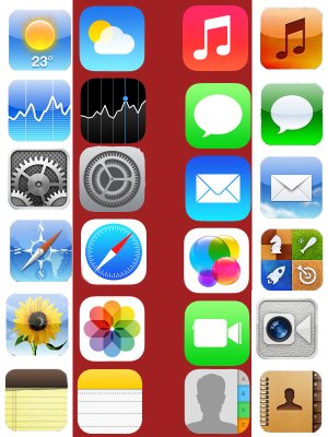
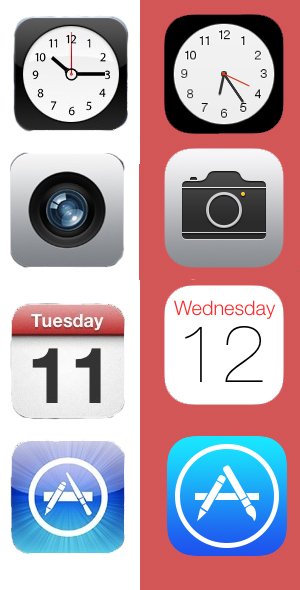
I figured it's pretty hard to without seeing the icons to think whether they really are that bad. So I just quickly put some of the native app icons together. In my opinion most of them look really good. I love the new game center icon, most of the others are just a flat version of the one before. Some however are just really bad offenders and look so damn ugly. Like for me Safari, Facetime(god that green), Settings and Weather(looks so comical now I feel like it comes out of the Super Mario game). Like I said I don't have a problem with the flat look but the weather icon for example they could use just the sun, ditch the 23 with some clouds behind not that bubbly looking thing they have now.
I figured it's pretty hard to without seeing the icons to think whether they really are that bad. So I just quickly put some of the native app icons together. In my opinion most of them look really good. I love the new game center icon, most of the others are just a flat version of the one before. Some however are just really bad offenders and look so damn ugly. Like for me Safari, Facetime(god that green), Settings and Weather(looks so comical now I feel like it comes out of the Super Mario game). Like I said I don't have a problem with the flat look but the weather icon for example they could use just the sun, ditch the 23 with some clouds behind not that bubbly looking thing they have now.
Attachments
Last edited:
")