ThePinkChameleon
Trusted Member
Now with the ability of widgets and custom icons, Apple really need to get rid of the shaded bottom dock or at least give us the ability to toggle on or off...just sayin.

Now with the ability of widgets and custom icons, Apple really need to get rid of the shaded bottom dock or at least give us the ability to toggle on or off...just sayin.

Waiting!!


We’re driving down to AC for the weekend so I’ll work on them then
 &
&  ....6ft.....
Now with the ability of widgets and custom icons, Apple really need to get rid of the shaded bottom dock or at least give us the ability to toggle on or off...just sayin.

Enjoy & have a blast but&
....6ft.....
Dmo
 and
and  6ft ! The casino won’t let us in if we don’t have
Thank you! Yesand
6ft <—-> ! The casino won’t let us in if we do have

 . Dmo
. DmoI wish ( shudda-cudda-wudda, I guess) I'd have saved screenshots of my Phones in the past where possible. Biggest change I remember was iOS 7, as my first was iOS 5 which updated to 6 shortly after I got the 4S....I think the buzzword was that the old icons were 'skeumorphic' ie looked like real things. I remember Notes looks like paper etc.
Screenshots of my Blackberries (or even pictures) and or my Treo) woyld have been nice!!
Didn't Beth Chapman ( Dawg's late wife) use a pink BB ( or was it a Motorola Razr Flip phone??
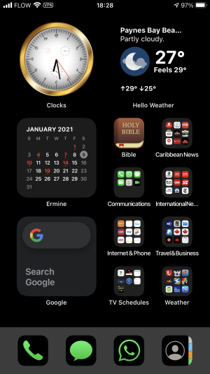
I think I'm approaching an end point now with what I have, other than maybe a few App changes. But what I have works well and easily and IMHO looks good. View attachment 130322
And don't spend your winnings at the Casino you won them! - spread the wealth around -. Dmo


What is the specific name of the clock widget you are displaying?
I can't find it in the App Store.
Looks great.
TIA
 and I really am not comfortable clicking on choices I don't understand. But I did file a bit also as suggested with 'Settings'/ 'Accessibility' / 'Display & Text Size' changing 'Reduce Transparency' and 'Increase Contrast. Result with both off was good and almost perfect BUT when looking at Today Screen or App Library, bright Widgets like my clock shone through. But using Reduced Transparency ON with Increased Contrast Off was better. Whatever I did seemed to blank out my folders but the effect was fine, but undoing whatever I did will. not bring the folders back even if I want them (?) Here is Reduced Transparency On, Increased Contrast OFF


