
-
After more than 15 years covering everything Apple, it’s with a heavy heart we announce that we will no longer be publishing new content on iMore and the iMore forums will be closing as of November 1st, 2024.
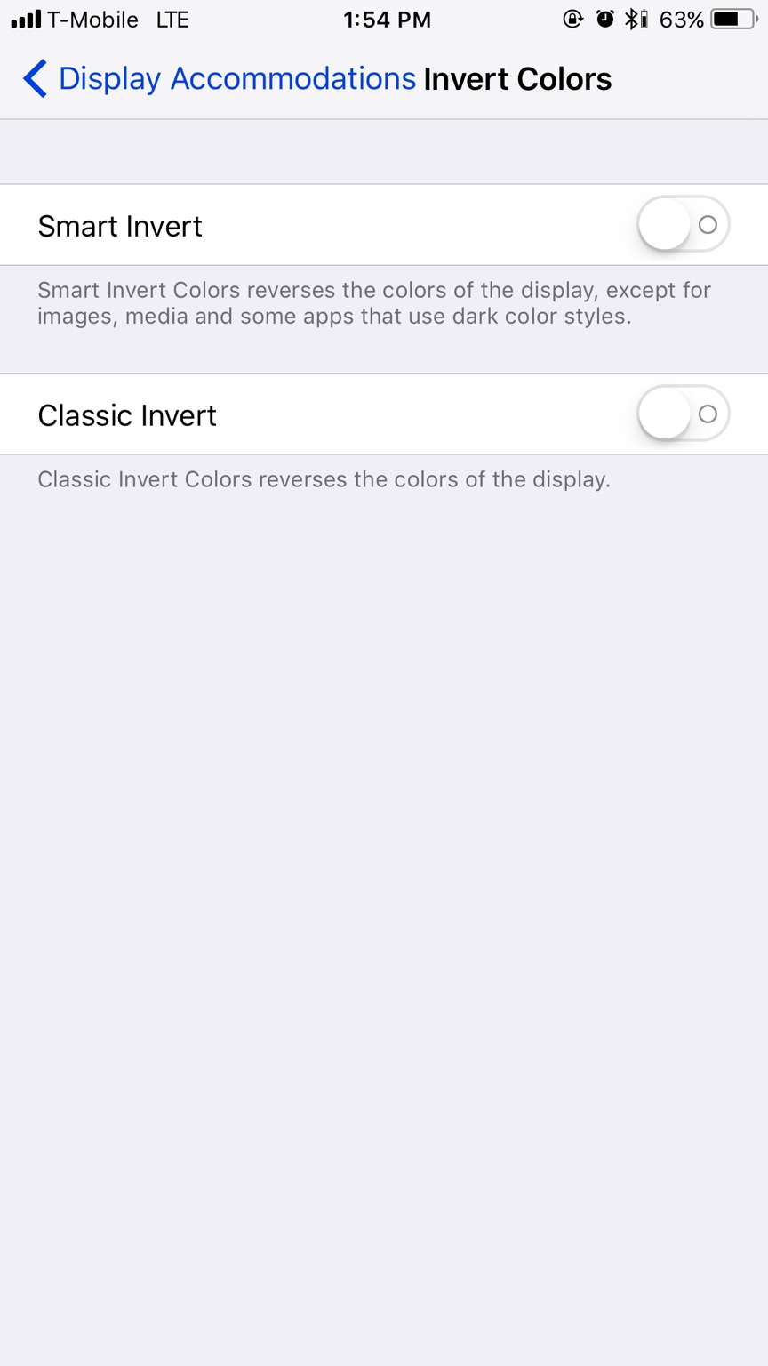
So there IS a dark mode they didn't discuss?
- Thread starter madman76
- Start date


Similar threads
Trending Posts
-

-
 The iMore 20K / 50K Post Challenge - Are you up for it?
- Started by Jaguarr40
- Replies: 31K
-

-

-