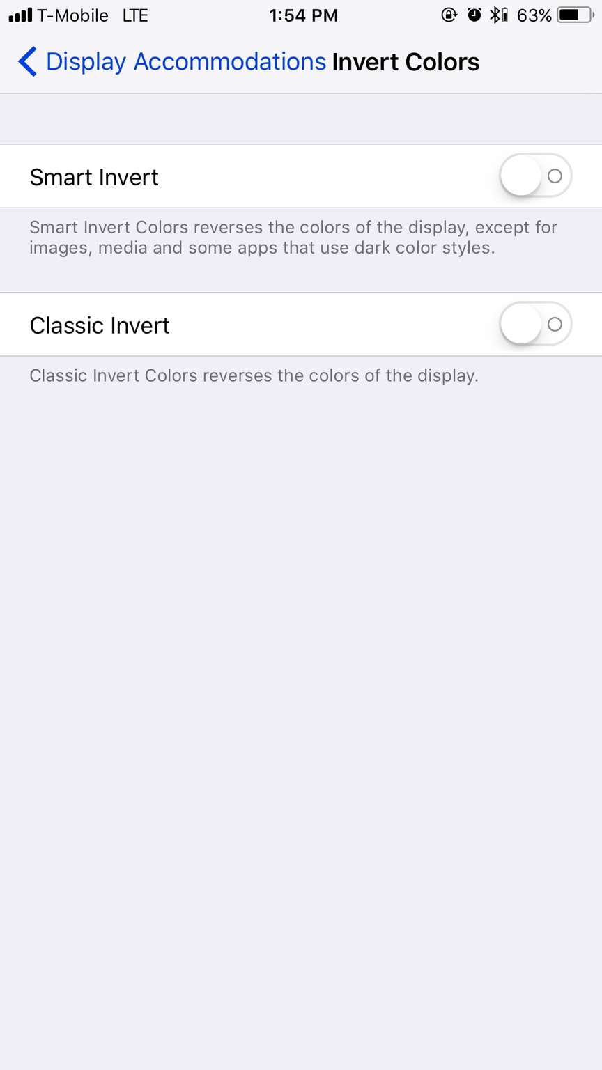
There’s a new “Smart Invert” option. It looks pretty cool on the home screen but it causes really weird color effects in most apps. Not quite what we are looking for in a true dark mode.
There’s a new “Smart Invert” option. It looks pretty cool on the home screen but it causes really weird color effects in most apps. Not quite what we are looking for in a true dark mode.
I think that Smart Invert probably requires developers to tag app assets a certain way so that the system knows how to treat them when the colors are inverted. That is why you're seeing inconsistent behavior all over the place.


 The iMore 20K / 50K Post Challenge - Are you up for it?

