bdtrader
Well-known member
re: BeWeather v3 (Beta) for iPhone
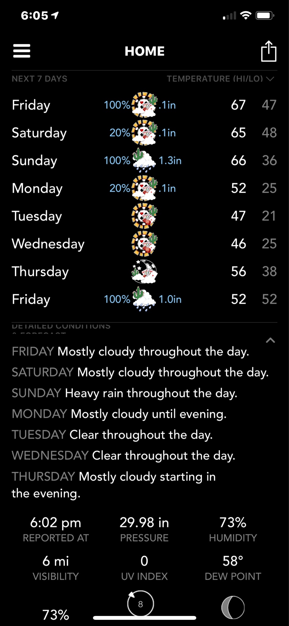
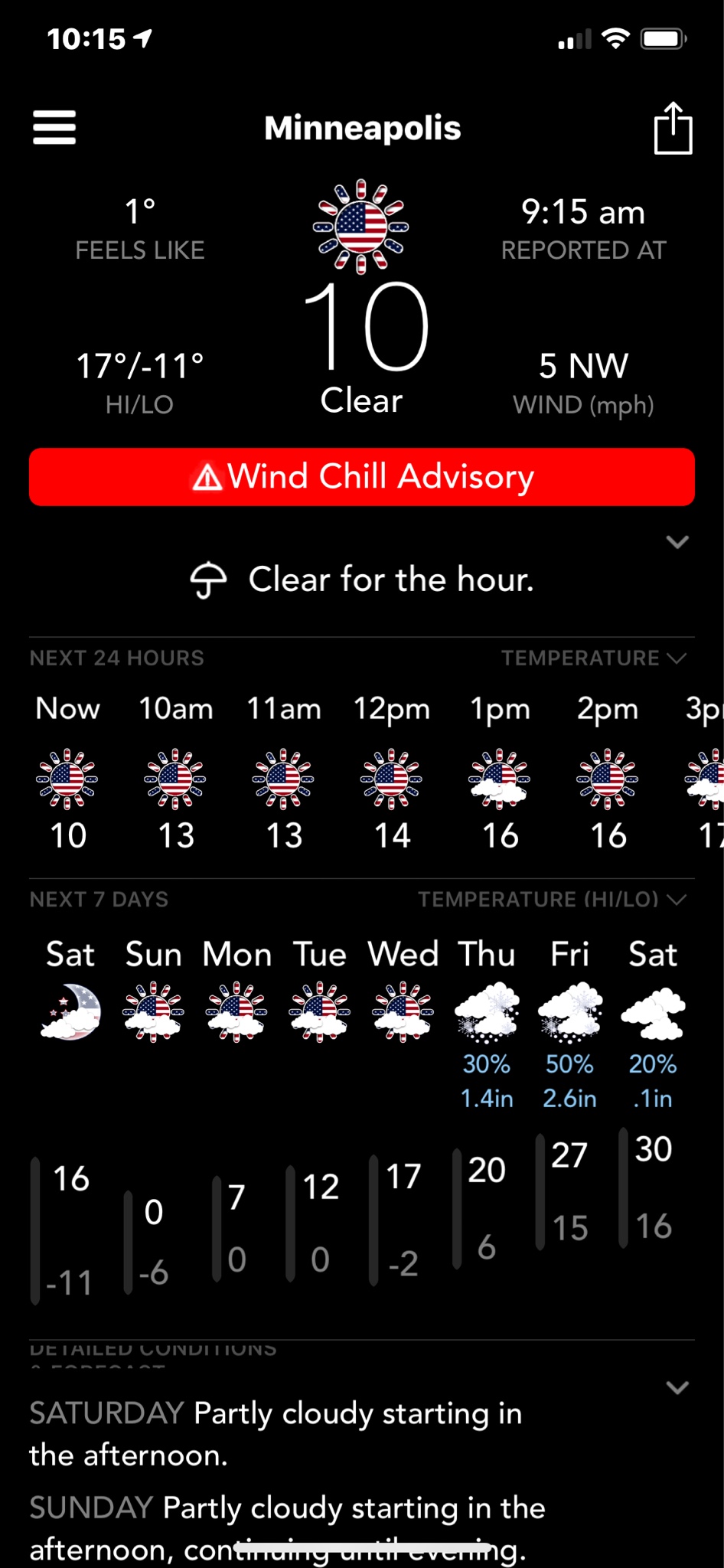
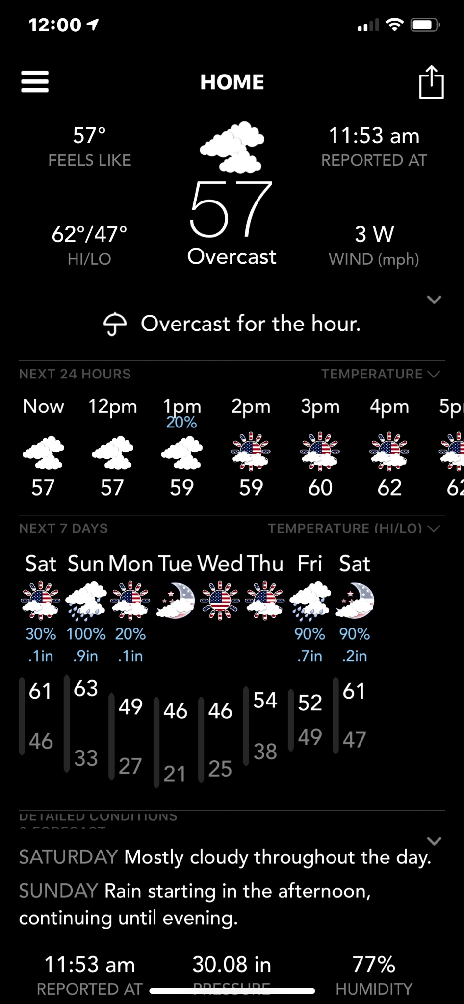
I am not saying don't read left to right. If you look at the 7 day section. It has a column for days, a column for forecast graphic and a column for temperature range. It makes it more readable to have these columns. I am suggestion something similar for the forecast text (or blend them together #3 alternative).
In the text forecast section when some of the forecast go to 2 lines and some are only 1 line (my example). I think it is harder to read. And the Day names are not emphasized and are in all caps which is not consistent with the day names in the section above.
And why wouldn't you want to have the bottom line more symmetrical with the circles more aligned?