Cool Photo Speed Dial

Lighterra

New member
Dec 23, 2010
4
0
0
Visit site
icon.png

Cool Photo Speed Dial

A dialer app done right! Polished, slick, fast, reliable and professional, unlike so many other dialer apps out there. We wrote this because we've tried all of the others over the years, and we thought it was about time the iPhone had a good, polished, graphical, visual photo speed dial. The app is an almost total replacement for the built-in Phone app, and the Contacts app too.

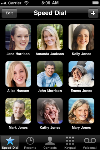
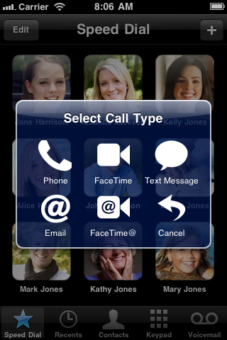
Cool Photo Speed Dial lets you see photos of your friends, family and other people you call frequently, then contact them with just two taps - one on the photo and one to choose the type of call (phone, FaceTime, SMS texting or email).

Turn your iPhone into the graphical, visual phone it truly wants to be!

Reviews welcome!

Promo Codes
3AHAH4H3HTXF
AELRAHHRP6TK
WWTMXPF3RMJA
47KFFEA4WMF6
AFLAJKREX6WP
(more available on request)

Website Link: Cool Photo Speed Dial website

App Store Link: Cool Photo Speed Dial app

Screenshots

screenshot-gridview.png
screenshot-calltype.png
screenshot-photoedit.png
screenshot-contacts.png
 
Last edited:

Alli

Well-known member
Apr 28, 2009
10,927
370
0
Visit site
So far, I really like it! Makes perfect sense, and very simple to use. Another of those things Apple should have included.
 

Alli

Well-known member
Apr 28, 2009
10,927
370
0
Visit site
One thing that would make it a ton better would be the alpha-bar on the right so that you can quickly jump to a contact, rather than always having to scroll everywhere.
 

Kale58

Well-known member
Nov 24, 2010
152
10
0
Visit site
The one thing I noticed right off the get go is that if you want to add two numbers for a single contact (e.g., mobile and work) into "speed dial", it uses the same photo and there's no way (as far as I can tell) to tell which one is for which number.
 

Lighterra

New member
Dec 23, 2010
4
0
0
Visit site
One thing that would make it a ton better would be the alpha-bar on the right so that you can quickly jump to a contact, rather than always having to scroll everywhere.

Yes, I agree... but that would mean removing the blue disclosure buttons and I really wanted it to be easy to go in and edit contact info while still being a single tap to start a call.

The approach with the alpha bar would mean that tapping on a contact always took you to that contact's detail screen, and you'd then have to tap again on the number you wanted to call.

I went back and forth several times on that one during development. It's easy to change, so if you feel it's a big issue I'll happily change it. No worries.

Thanks for the feedback!
 

Alli

Well-known member
Apr 28, 2009
10,927
370
0
Visit site
I'm confused. Right now if I can get to the contact, tapping on the arrow where the alpha bar would be, takes you to the full contact detail. Tapping the contact gets you to the dial screen. I'd rather not go to the contact detail at all than have to scroll forever to get to the S's.
 

Lighterra

New member
Dec 23, 2010
4
0
0
Visit site
The one thing I noticed right off the get go is that if you want to add two numbers for a single contact (e.g., mobile and work) into "speed dial", it uses the same photo and there's no way (as far as I can tell) to tell which one is for which number.

One of the explicit goals for version one was to have no settings whatsoever. None, zilch, zero! That way, you're forced to pick excellent defaults and make as many decisions automatically as possible, so that later on when you do add some settings, you only add the ones that are really needed/wanted by users.

The ability to change the labels is certainly a setting some people want, and I can promise it is coming in the next version, probably in two or three weeks time. You'll have the option to show first names, nicknames, last names, number labels (if multiple), or just any custom string you want, either on a per-item basis if you like, or for all items.

Other settings that people seem to want to control are the gloss strength & curvature for the buttons, and the ability to use large buttons and scroll rather than always scaling down to fit (eg: use the 2x2 size even with 10 contacts listed in the speed dial view, and scroll).

The code for all of that stuff is already in place, it's simply a matter of exposing it by doing a GUI settings screen, but like I said I *really* want to avoid having too many settings, so I wanted some user feedback first. Your feedback will be taken very seriously! Thanks!

If there are any other settings which you feel you'd really like, or need, please let me know.
 

Lighterra

New member
Dec 23, 2010
4
0
0
Visit site
Right now if I can get to the contact, tapping on the arrow where the alpha bar would be, takes you to the full contact detail. Tapping the contact gets you to the dial screen. I'd rather not go to the contact detail at all than have to scroll forever to get to the S's.

Yep, noted. And I could change that and put up the alpha bar instead of the disclosure buttons.

But it's essential to be able to get to the contact's details, in order to change them, set photos etc. So once the alpha bar was there, then tapping on a contact would have to take you to their details, and to make a call you'll need to tap again on the number you want to call.

You can't have both the alpha bar and the disclosure buttons, there isn't enough room - it would be impossible for people to accurately select between them.

The other alternative, which is coming in version 2, is search. There will be a search text field at the top, and tapping in it will bring up the keyboard and start doing a live search, so jumping to the S's would be two taps - one on the text field, and then S on the keyboard.

Can I ask this... if search was there, would you still want the alpha bar?
 
Last edited:

Members online

Forum statistics

Threads
260,360
Messages
1,766,546
Members
441,240
Latest member
smitty22d2