Can I wander off topic a little bit?
(Thanks).
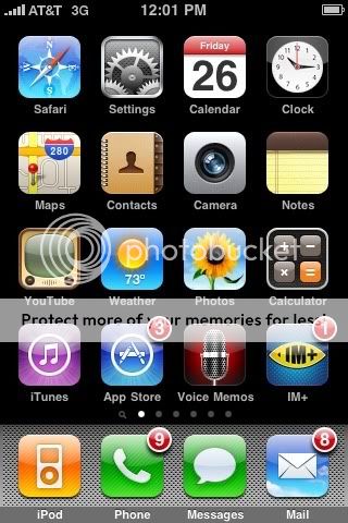
Is it time for Apple to start considering new structure for the Phones interface?
I mean, we soon learned that having icons littering our PC/MAC desktop was NOT the way to go when we started to accumulate more than 7 applications.
Most distros of Linux place things in a menu tree by Category. Microsoft never did learn this.
Apple designed this screen interface before there was any Apps or App store (other than what shipped on new phones).
Lots of folks in this thread organize by category. Couldn't the phone come with this structure built in (with option to customize of course). Perhaps a given APP could be in more than one category. Same App, just appears in two different places.
Is the Pre Card structure automatically more useful simply because it attempts to build on categories?
Can Apple remain long with this cluttered hodge podge of random placement of
Apps without falling behind the industry?
I don't think search is much of a solution, not to my idea of organization any way. The problem of search is you have to know names. Some people are more image oriented (which is why we invented icons in the first place).
Perhaps Apple is planning that we all going to be talking to our phones to call up apps, and therefore organization is not needed. Simply announce "BeeJive" and it pops up?
Anyway, if you believe the hype of Apple and its fanboys: Apple had be best designs and user interface.
I submit that this is not the case any longer with regard to this AGING and somewhat childish interface, and I'm predicting that now that Jesus Jobs is back its long overdue for replacement with a totally new concept.


 The iMore 20K / 50K Post Challenge - Are you up for it?

