
Derrick4Real
Well-known member
Re: iOS7 looks awful
There are some great side by sides comparison shots here New in iOS 7 For iPad, iPhone + iPod touch: Details + Screens | iLounge Article it's just not my cup of tea.
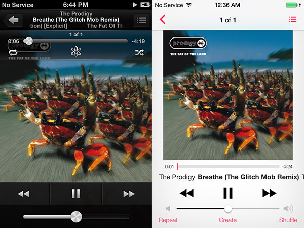
Gotta say i prefer the black player to white. sue me. I wish they'd get rid of those create, repeat and shuffle buttons because i never use them and my big fingers always hit them on accident.
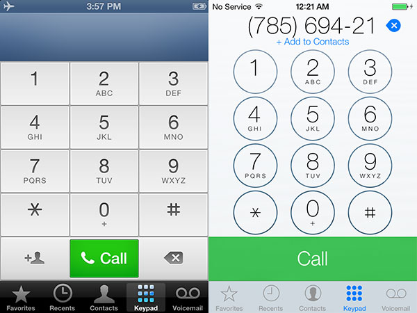
Just not a big fan of the circle buttons and the whole. It's like a toddler drawing to me. But whatever. I rarely make phone calls with the dialer anyways.
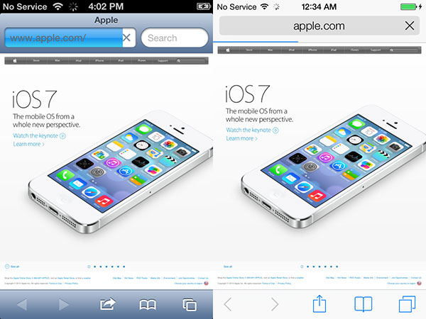
Safari, i'm fine with. didn't much care for it before. I used Chrome. This may bring me back.
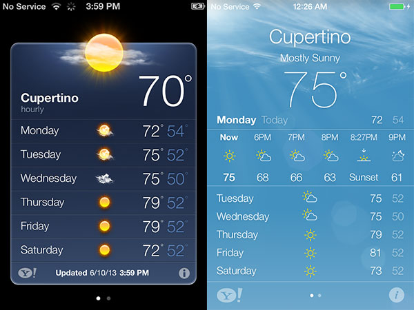
I like it but notices it's basically the Yahoo weather app which i currently use. Even the symbols for sun, cloudy etc are the same. But i'm cool with it.
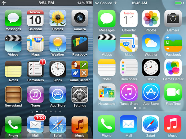
Icons look horrible to me. Genrally i prefer them with the edge. They remind me of Android launch icons Someone tell me what is that photo icon. How does that say photo? The old one sucked too. But how about maybe a picture of a photograph or a polaroid? Seems logical to me. Gamecenter? Looks like a bunch of bubbles. I don't get it. At least the camera icon is better in this version. But just aesthetically this, to my tastes doesn't look nice and classy.
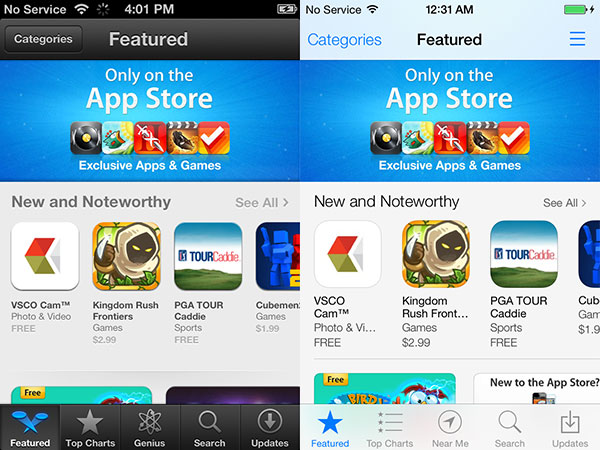
I'm surprised the app store seems unchanged. I hope they address that in the future because it's cumbersome to use when you're results show just 4 or 5 images a page. That deters me from browsing and discovering new apps not on the front page.
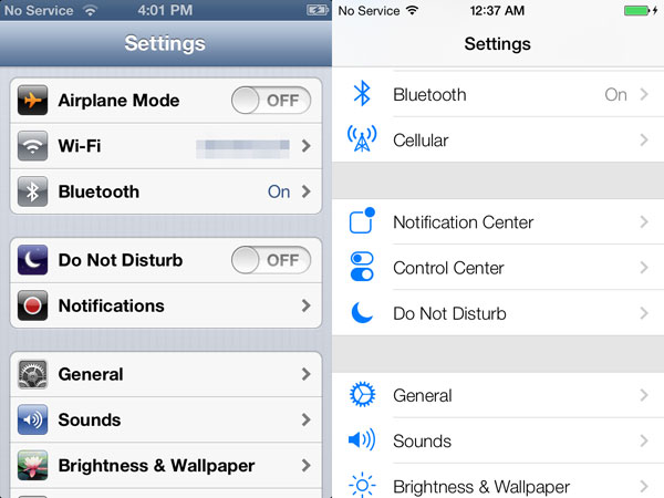
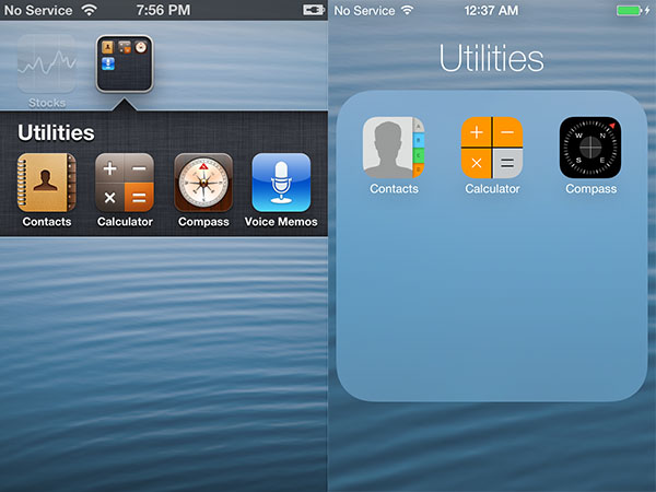
No issue with the new folders but i don't get the look of the icons. Is the new contact icon really nicer than the old? They just look, as my dad would say "half-assed." As in, "Boy you did a half-assed job mowing the lawn now do it right before i beat your ****."
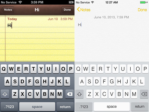
I don't care about note cause i use Catch but i prefer the darker keyboards. To me i looks much more polished with the shadowing. Reminds me of when i had a webos phone and Preware had all these ugly digital keyboards you could ad. Most looked bad.
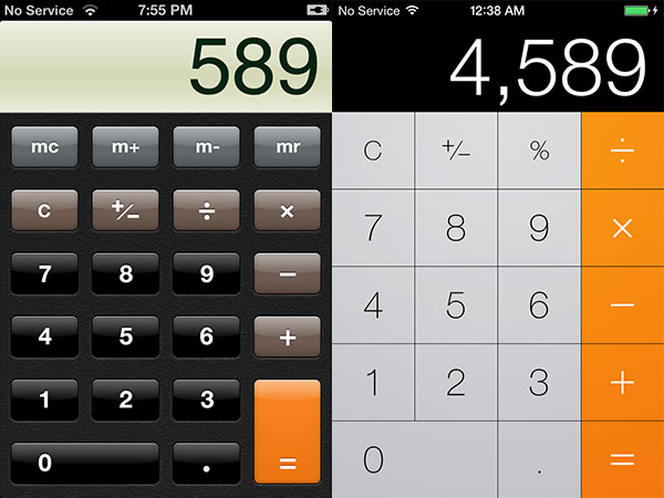
This looks to me like they didn't have time to finish.
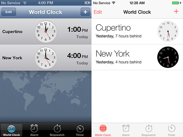
Monochrome i get but to me, the old version just looks better. The clocks on the right look like bad clip art to me
It's not all bad. I like some new features like the toggles, additions to safari, etc. Some things above i don't specifically care much about like notes, or calculator or compass cause i'm never gonna use them. I just think they are bad style choices. But i'll see the keyboard everyday. Icons i see everyday. I'll hate the white music player all day everyday. For me I've yet to decide if i'll continue with Apple. Looks matter to me. It's a huge part of why i like apple products. I'm not utilitarian totally. In fact i was gonna buy the first android device till i saw Android and found the original ugly (nicer now) and the ugly chinned htc device. But the big thing for me is the Music player. i listen to music every day. I've got a 64gb player and don't use itunes match. it's varied in genre and it's stored on hard drives by genre. So i just pray they still organize music the same, as when i click on genre i want it to go to artist then album and not as my old pre did go directly to song and give me a list of 8000k songs to sift through. especially since many times i don't know the exact song name i just know the album it's on because that's how i first listened to them. So interface changes and dislikes aside i hope they don't muck up the music player or make it cumbersome to navigate by genre. That's one of my pet peeves.
There are some great side by sides comparison shots here New in iOS 7 For iPad, iPhone + iPod touch: Details + Screens | iLounge Article it's just not my cup of tea.
Gotta say i prefer the black player to white. sue me. I wish they'd get rid of those create, repeat and shuffle buttons because i never use them and my big fingers always hit them on accident.
Just not a big fan of the circle buttons and the whole. It's like a toddler drawing to me. But whatever. I rarely make phone calls with the dialer anyways.
Safari, i'm fine with. didn't much care for it before. I used Chrome. This may bring me back.
I like it but notices it's basically the Yahoo weather app which i currently use. Even the symbols for sun, cloudy etc are the same. But i'm cool with it.
Icons look horrible to me. Genrally i prefer them with the edge. They remind me of Android launch icons Someone tell me what is that photo icon. How does that say photo? The old one sucked too. But how about maybe a picture of a photograph or a polaroid? Seems logical to me. Gamecenter? Looks like a bunch of bubbles. I don't get it. At least the camera icon is better in this version. But just aesthetically this, to my tastes doesn't look nice and classy.
I'm surprised the app store seems unchanged. I hope they address that in the future because it's cumbersome to use when you're results show just 4 or 5 images a page. That deters me from browsing and discovering new apps not on the front page.
No issue with the new folders but i don't get the look of the icons. Is the new contact icon really nicer than the old? They just look, as my dad would say "half-assed." As in, "Boy you did a half-assed job mowing the lawn now do it right before i beat your ****."
I don't care about note cause i use Catch but i prefer the darker keyboards. To me i looks much more polished with the shadowing. Reminds me of when i had a webos phone and Preware had all these ugly digital keyboards you could ad. Most looked bad.
This looks to me like they didn't have time to finish.
Monochrome i get but to me, the old version just looks better. The clocks on the right look like bad clip art to me
It's not all bad. I like some new features like the toggles, additions to safari, etc. Some things above i don't specifically care much about like notes, or calculator or compass cause i'm never gonna use them. I just think they are bad style choices. But i'll see the keyboard everyday. Icons i see everyday. I'll hate the white music player all day everyday. For me I've yet to decide if i'll continue with Apple. Looks matter to me. It's a huge part of why i like apple products. I'm not utilitarian totally. In fact i was gonna buy the first android device till i saw Android and found the original ugly (nicer now) and the ugly chinned htc device. But the big thing for me is the Music player. i listen to music every day. I've got a 64gb player and don't use itunes match. it's varied in genre and it's stored on hard drives by genre. So i just pray they still organize music the same, as when i click on genre i want it to go to artist then album and not as my old pre did go directly to song and give me a list of 8000k songs to sift through. especially since many times i don't know the exact song name i just know the album it's on because that's how i first listened to them. So interface changes and dislikes aside i hope they don't muck up the music player or make it cumbersome to navigate by genre. That's one of my pet peeves.
")