
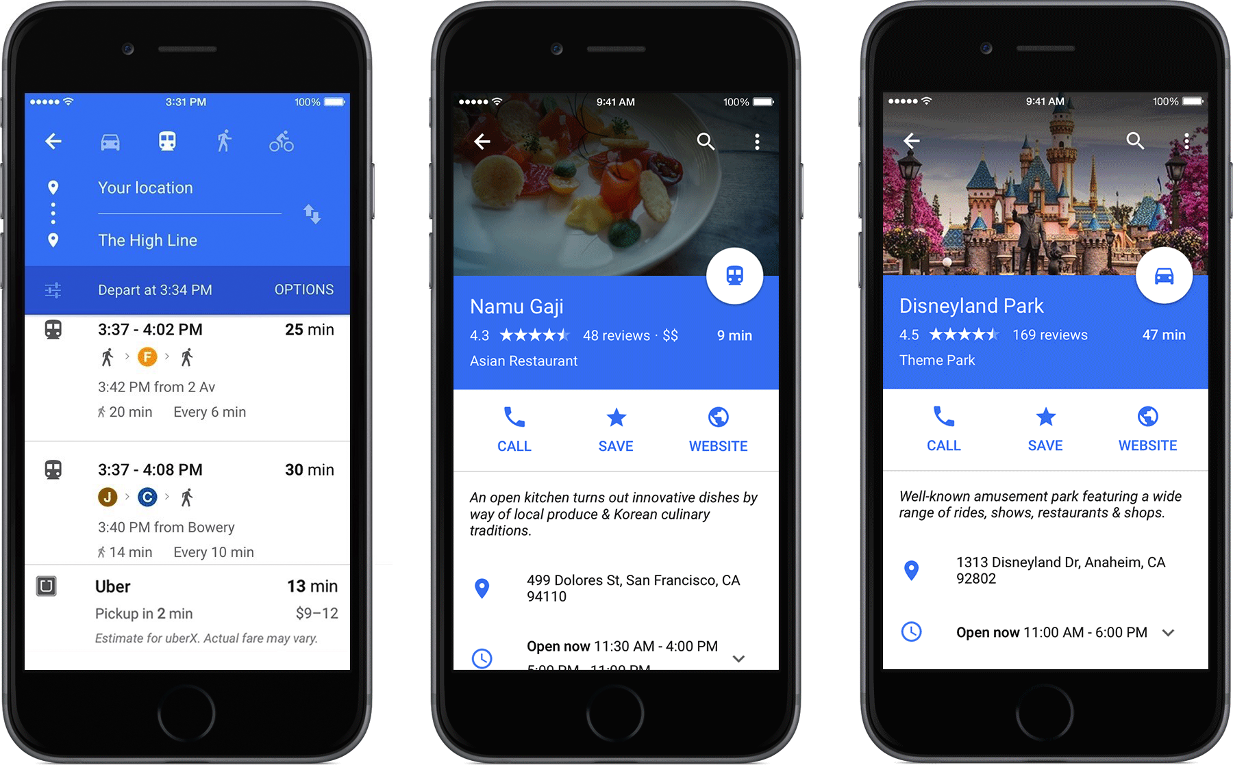
Google Maps is getting a redesign that will make the app on iPhone and iPad look a lot more like its Android counterpart. The design draws on Google's new "Material Design" language, which pervades the updated Android 5.0 Lollipop, bringing a layout that's flatter and layered, yet with lots of colors. In the case of Google Maps, lots of blue. It's a similar look and feel to the recently-released Inbox by Gmail.
Full story from the iMore Blog...